Toronto winters get cold. A morning walk to the office becomes an arctic expedition, so many pedestrians commute through the world’s largest underground shopping complex to stay warm.
It’s not a perfect system, but as someone with an admittedly bad sense of direction, I’m interested in the PATH’s wayfinding problems.
Because it’s a neighborhood of privately owned basements, there are some competing interests, and PATH is wrought with strange design decisions. Not enough value to a business, and not much utility for a walker.
The fundamental problem with the PATH is the speed of walking. Walking slow benefits the businesses, walking fast benefits the walker.
A Case Study
My wife and I went on an adventure in the PATH to get from King and Simcoe to Dundas Square. Here’s a map.

One thing becomes obvious once you descend into the catacombs. As opposed to an airport terminal, with long lines of sight, the Path’s tunnels have many narrow twisty spaces, less signs, and lots of forks.
In dense mall areas, it’s hard to pick an important detail out of the signage fighting for attention against the crowds of people. There’s also no indication that the stretch up ahead will go through a parking lot, or that they’ll be stairs, or a food court.
I had to take out my phone many times to refer to the map. There were many moments of wondering which way to go, scanning for clues at each fork. Sometimes, we just took a guess.The PATH would make for an interesting challenge in The Amazing Race.
Step 1: Identify the desire paths

Given how many use the PATH, we can use data to identify any emerging main arteries and desire paths, as well as the enter/exit points.Knowing these, we can establish a track that is easy to navigate, but also funnels people through potential sales. Everyone wins. An example of this is IKEA’s store design. It nudges you into a main path that funnels you through, but it also has marked shortcuts. Most people will follow the main path, and it’s conducive to a dilly-dallying shopping experience, but at any point you can make a beeline for the restaurant.
Once the main arteries have been defined and named, a walker’s list of directions to their destination becomes easier to memorize, and there’s more time to think about what to eat along the way.
Step 2: Establish a consistent visual style
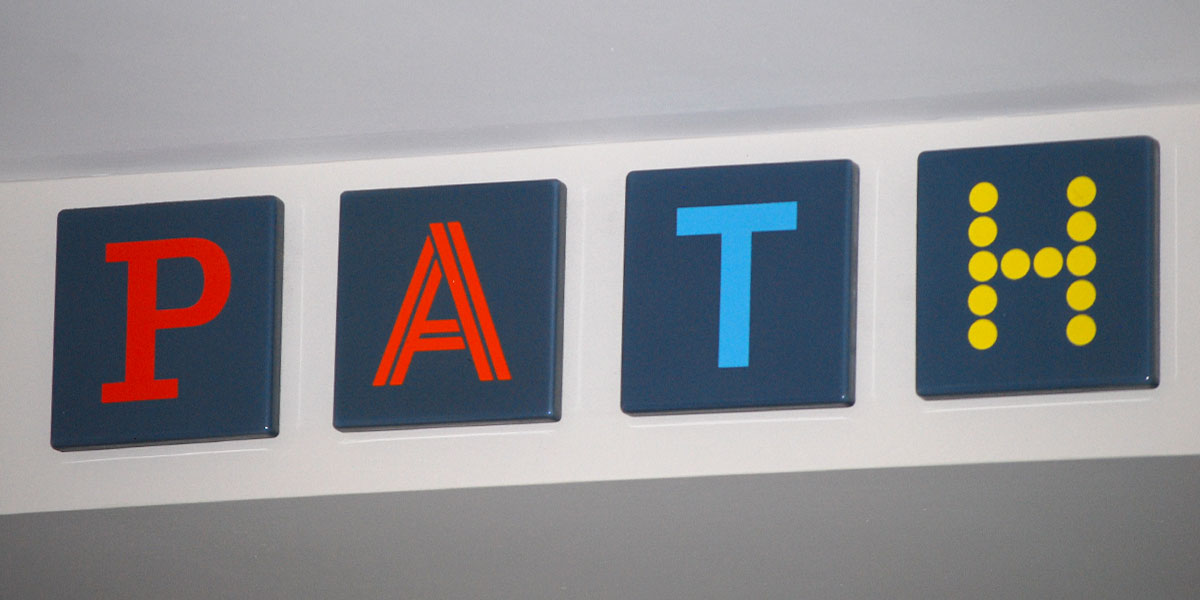
The late 80s early 90s introduced the Memphis Group art style, which had high contrasting typefaces. That’s likely why the letters in the PATH are so different.
I quite like the logo, when it’s used properly. It’s a valid way of expressing individual style among a group. Unfortunately, the PATH identity tries to be more than that. The letters and colors in PATH correspond to NESW and the directions on the signage, except it starts at South, not North. Also, the colors for East, South and West are indiscernible for people with red-green color blindness.
It’s an example of how decoration gets in the way of function, and then things become needlessly confusing. Like how the wall maps are sometimes rotated, so instead of South being at the bottom, it’s East. This strange relationship between the four colors/letters of the PATH and the cardinal directions doesn’t make enough sense to be memorable or helpful.

Step 3: Map it to the city
Unless you remember the building names, it’s hard to model the PATH in your head. Even worse, sometimes it’s hard to tell if you’re still going in the correct general direction. Where you are in relation to the streets above would be helpful. This is attempted in some of the larger buildings, but they’re subtle and don’t indicate the angles or the intersections.

Some buildings are bigger than others, and critical details are buried in the simplified squares and lines.
The PATH needs a good map. Toronto has the advantage of being a perfectly aligned grid with memorable main streets.Visualizing the PATH as a series of directions and waypoints can help confirm that you’re on the right track, like in a metro system. Knowing what’s immediately ahead and behind you saves you from fishing out your phone, and the twists and turns become less important. All you need to know is the name of your destination and what track it’s on.A good map can manage a lot of complexity. It becomes more complicated at a glance, but it’s infinitely more helpful when you actually use it.

Step 4: Balance shopping and commuting
Because it’s a privately owned neighborhood, it makes sense for the buildings’ owners to focus on the building names, rather than another system, like the universal streets above.
It’s also in their best interest to trap you inside, like a casino.Fixing this is the biggest step. Shopping and commuting can be elegantly integrated, but companies have to treat their connection to the PATH as a brand-building opportunity; linking their own products to the basic service of helping people get to where they need to go.
More efficiency, more people, more business. It’s no cakewalk, but nothing at this scale ever is.