From Pick Up to Prime Time: How to Fix the Big 3 Basketball League
A half court game makes the sport more accessible for players, but at what cost to viewers?
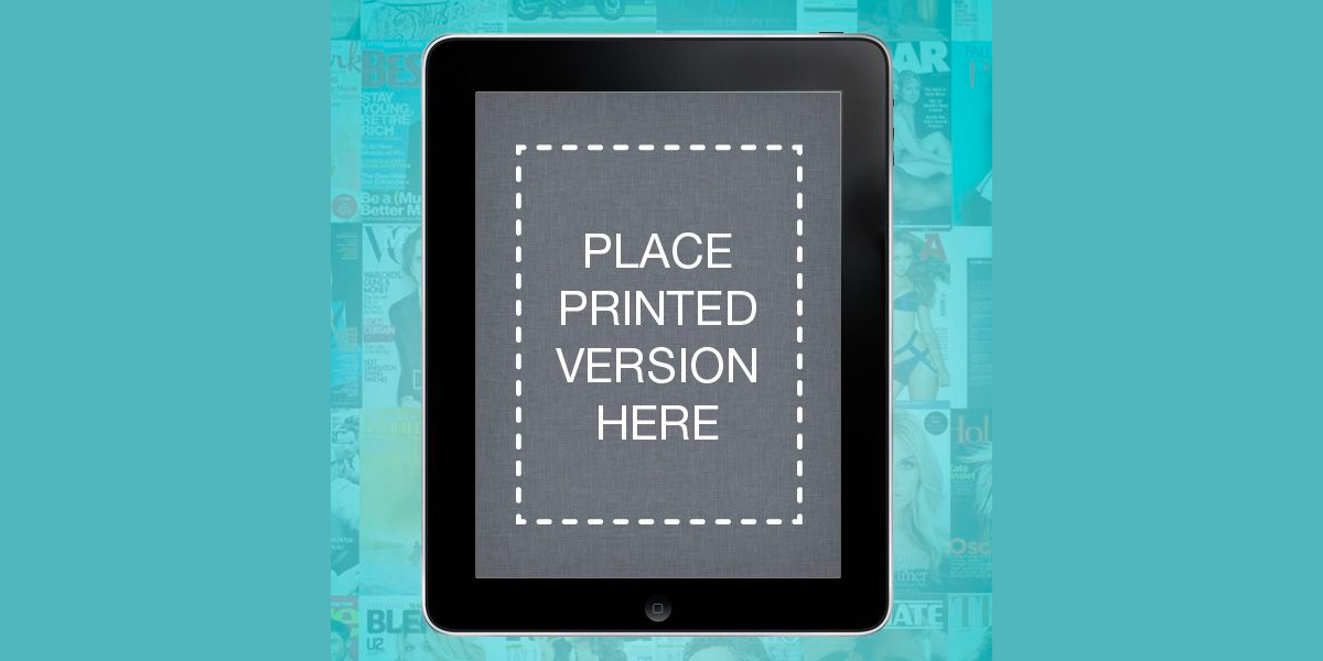
Don’t be dazzled by those flashy iPad magazine apps or digital page-turners. Creating something like the Wired iPad app may get a round of high-fives from print designers, but put it beside the web experience and it becomes decoration more than anything useful.
The mentality with most magazine apps seems to be, “Let’s make it look just like print.” After all, a tablet is roughly the same size and thickness as a print magazine, so users will use it the same way, right?
Wrong.
Think about the evolution of the calendar. A printed calendar typically consists of 12 pages: new month, new page, new cute kitten image.
For added convenience, there are also miniature versions of the previous month’s and next month’s layouts, and on the back of the calendar there’s a grid of all 12.
You simply fill the boxes with content, then flip to the next page when the month is through.
Now take that static interface and translate it to a digital device. On a dynamic interface, time can be represented in a variety of ways and the content can be manipulated to suit whatever you’re interested in at that moment.
You can sort by hours, days, weeks, or months. Or you can choose to view only work appointments or your kid’s soccer games or jam sessions with your band. You don’t have to see everything at the same time.
By shifting to digital, a calendar becomes more versatile and useful than ever. And because of alerts, we don’t even have to check it anymore!
What makes a magazine is a whole other discussion, but I think we can agree that it’s not about the neat columns and colourful pages. Ultimately, it’s about the content and the experience of consuming that content.
The goal of designing magazines for the screen should be to improve the magazine experience, even if it means breaking some of the rules of print.
While the print reader is forced to move from issue to issue, page to page, column of text to column of text – next, next, next – the web reader scrolls through at her own pace and can fly off to anywhere she pleases.
There is no one direction. If there is a natural “next”, there will be an easy way to get to it, placed right where she’d expect it.
On a touchscreen tablet, swiping is so much fun that designers have started using it as a way to move to the next article (instead of the next page), transforming our conception of a magazine from a series of pages to a collection of articles.
This is a significant shift, but again, swiping is meant to mirror the way we flip through pages in a print publication. It’s still about moving forward. What if we were no longer compelled to move in a single direction at all?
The “linear to web” shift that we saw with calendars hasn’t happened yet with magazines, and won’t happen until we rethink the idea of “next.”
From radio to TV to print, the old media paradigm is all about one thing (program, ad, article) leading to another. But the web experience isn’t linear. Instead of a single thread of content it’s, well, a web.
New media already got over this hump a decade ago. A network consisting of linked web pages (you know it as the World Wide Web) really took off when users were able to easily browse and contribute to that network (Web 2.0.).
Now our networked devices weave that content into our daily lives through things like blogs and RSS feeds and cloud-based organization tools (see: Google).
The reason this content is so nimble is because it was born digitally and is semantically formatted, not bound to a series of arbitrary separations like pages in a PDF.
How can magazines catch up? Wouldn’t you like to know!
For starters, design for the medium and stop making magazine apps that simply add a pretty layer of decoration to an existing product. Focus on the content and the experience. And don’t try to make it look like print, just because.