From Pick Up to Prime Time: How to Fix the Big 3 Basketball League
A half court game makes the sport more accessible for players, but at what cost to viewers?
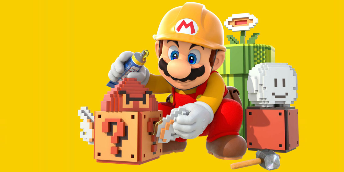
I remember not being able to finish the original Super Mario Bros. on NES. I can now beat that game handily, like riding a bike. There’s a lot to be said for the iconic levels from that game and how memorable they are after all of these years. Now, as a UX and design professional, I can appreciate Shigeru Miyamoto’s creation through a different lens.I’ve had Super Mario Maker on Wii U for a couple of months now, and it’s been a blast playing the community’s levels and creating some of my own. It feels like I’m a kid again.There are three UX design principles that are perfectly applicable to Super Mario Bros., and the levels that employ them make this game as great as it is.

There’s a thin line between difficult and unfair. Ample forgiveness can make a level fun and challenging, instead of frustrating and cheap.
Recall level 1-1 from the original Super Mario Bros. There's a section with two gaps. The first one has safe, solid ground in between, the second has a bottomless pit. This sequence gives a gentle indication of what's to come, while naturally increasing the stakes.
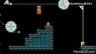
A common way of frustrating players is by placing unfair off-screen surprises, like thwomps suddenly falling from above. A well-designed level will first give smaller, more manageable versions of these surprises, maintaining the flow of the level without telegraphing too much. The observant player can deduce what’s ahead and react accordingly.
If the player needs a power-up to progress, like a mushroom, then it should be in infinite supply. Players shouldn't have to restart because their Mario is small and can't break bricks. Any level that forces a dead-end can make the player just give up and skip.
Simply killing the player on purpose is bad design. Smart pacing makes a level challenging, not cheap. The best levels introduce a concept, then gently test the player’s understanding of that concept, before eventually challenging their mastery of it.
With the tools available in Super Mario Maker, there are many ways to add visual polish to a level, which can make a level "feel" good. Symmetry, contrast and other Gestalt design principles work here.
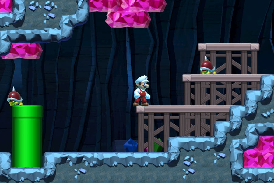
Mixing up different ground tiles and adding foliage is an easy way to make a level feel richer and add flavour to a level. Semi-solid platforms (the ones you can jump up through) are good for creating faux-interior parts of a level, like a house or an airship.
Most players have now seen what the Mario engine is capable of, and won’t appreciate the novelty in a bunch of stuff on the screen, just because. For example, triple-stacked winged bowsers shooting bullet bills, or 100 1ups all over the screen are ridiculous and funny the first time you see them, but it’s not good design, and they add little value to your experience.
When it comes to Mario, less is usually more. Each element should have a purpose, and the most beautiful levels feel like they were made by Nintendo.

Affordance is a fancy UX term for how users interpret an element for interaction, like how a button looks like it can be pressed. In Super Mario Bros., a player will see the configuration of blocks and platforms in front of him, and interpret what he needs to do in order to progress.Coins are the most natural way to add these affordances, strategically placed to show the player where to jump, or where the areas of interest are. Coins are especially important when trying to subtly hint at hidden parts of a level.Another way to help players is by emphasizing the functions of elements. For example, when creating an exit-only pipe, it should be configured in a way so that the player doesn’t mistake it for an entrance.
Ultimately, players shouldn’t have to take blind leaps of faith because they don’t know where to go. It's up to the designer to communicate the level's intent to the player.
After a period of many cheap levels with shallow gimmicks, the Super Mario Maker community has matured and begun creating worthwhile player-centric levels out of some really good ideas. There are still hellishly difficult levels, but they are niche and more of a spectacle for the rest of us. Recently on Armchairempire.com, they interviewed a few of these spectacular Mario players, it's a worthy read if you are interested.
The most memorable levels rise to the top because of the game’s smart evaluation mechanics. Players are encouraged to rate ("star") levels after they complete them, and designers can only upload more when they have positive feedback.
Designers can also track the analytics (completion rate, skips, etc.) of their creations, but the most fun I’ve had with the game is showing my creations to a friend, and watching them play it for the first time.
With Nintendo's commitment to continuously improve the game and add new levels, as well as foster a growing and talented community, Super Mario Maker is a dream come true for my inner child, and it can teach a new generation of creative kids more than just how to stomp on goombas.